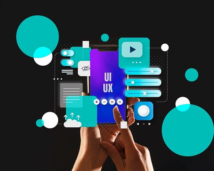
User experience (UX) design is the process of creating products or services that provide meaningful and satisfying experiences for users. UX design involves various aspects, such as usability, accessibility, functionality, aesthetics, and emotions.
One of the ways to improve UX design is to use microinteractions. Microinteractions are small, interactive moments that occur when users interact with a product or service. They can be in the form of simple animations, sounds, or haptic feedback that provide users with information, guidance, or delight.
Microinteractions can make a product or service more engaging, intuitive, and human. They can also help users accomplish tasks, connect devices, adjust settings, view or create content, and more.
In this article, we will explore how microinteractions can enhance UX design through subtle animations. We will cover the following topics:
- What are the benefits of using microinteractions in UX design?
- What are the best practices for designing microinteractions with animations?
- What are some examples of microinteractions with animations in real products or services?
The Benefits of Using Microinteractions in UX Design
Using microinteractions in UX design can bring many benefits for both users and designers. Some of these benefits are:
- Creating a positive emotional effect on the user: Microinteractions can create a sense of satisfaction, curiosity, or fun for the user by adding subtle animations to their actions. For example, a microinteraction can animate a button when the user clicks on it, making it feel more responsive and rewarding.
- Providing immediate feedback to the user: Microinteractions can provide feedback to the user based on their actions or the state of the system. For example, a microinteraction can animate a progress bar when the user is uploading a file, indicating how much time is left or how fast the upload is going.
- Guiding the user through the product or service: Microinteractions can guide the user through the product or service by highlighting important features, suggesting actions, or explaining functions. For example, a microinteraction can animate an icon when the user hovers over it, revealing its purpose or functionality.
- Encouraging the user to interact with the product or service: Microinteractions can encourage the user to interact with the product or service by creating curiosity, interest, or motivation. For example, a microinteraction can animate a notification when the user receives a message or an update, prompting them to check it out or respond.
- Preventing user errors and frustration: Microinteractions can prevent user errors and frustration by validating inputs, correcting mistakes, or offering solutions. For example, a microinteraction can animate an error message when the user enters an invalid email address, suggesting a valid format or offering an alternative option.
The Best Practices for Designing Microinteractions with Animations

Designing microinteractions with animations requires careful consideration and attention to detail. Here are some best practices for designing microinteractions with animations:
- Keep it simple: Microinteractions should be simple and easy to understand. Avoid overcomplicating them with too many animations or effects. Use animations that are relevant and appropriate for the context and purpose of the microinteraction.
- Be consistent: Use consistent microinteraction designs throughout your product or service. This helps create a cohesive and familiar user experience. Follow established design principles and guidelines for animations, such as timing, easing, duration, and direction.
- Provide feedback: Microinteractions should provide feedback to users based on their actions or the state of the system. Use animations that are clear and informative. Avoid animations that are ambiguous or misleading.
- Make it delightful: Microinteractions should be enjoyable and add value to the user experience. Use animations that are engaging and expressive. Avoid animations that are boring or annoying.
Some Examples of Microinteractions with Animations
To illustrate how microinteractions can enhance UX design through subtle animations, here are some examples of microinteractions with animations in real products or services:
- Gmail: Gmail uses microinteractions to provide feedback and guidance to users when they compose an email. For example, when the user attaches a file to an email, a progress bar animates at the bottom of the screen, showing how much time is left for the upload. When the upload is complete, a checkmark animates next to the file name, indicating success.
- Spotify: Spotify uses microinteractions to create a more engaging and immersive music experience for users. For example, when the user plays a song from an album or playlist, a circular animation appears around the play button, showing how much time has elapsed or remains for the song. When the user pauses or resumes the song, a pause or play icon animates inside the circle.
- Instagram: Instagram uses microinteractions to encourage users to interact with its content and features. For example, when the user likes a post by tapping on it, a heart animation appears on top of the image, confirming the action and creating a sense of satisfaction. When the user swipes left or right on a story, a transition animation shows the next or previous story, creating a sense of continuity and curiosity.
See Too: https://gjsmart2023.fun/?p=120
Summary
Microinteractions are small, interactive moments that occur when users interact with a product or service. They can be in the form of simple animations, sounds, or haptic feedback that provide users with information, guidance, or delight.
Microinteractions can enhance UX design by creating a positive emotional effect on the user, providing immediate feedback to the user, guiding the user through the product or service, encouraging the user to interact with the product or service, and preventing user errors and frustration.
Some best practices for designing microinteractions with animations are to keep it simple, be consistent, provide feedback, and make it delightful.
Some examples of microinteractions with animations in real products or services are Gmail, Spotify, and Instagram.
