
Dark mode is a popular trend in web and mobile app design that offers users a different way of experiencing digital products. Dark mode, also known as night mode or dark theme, is a UI display mode that uses dark colors, usually black or dark gray, as the background color and light colors, usually white or bright hues, as the foreground color. Dark mode can provide many benefits for users, such as reducing eye strain, saving battery life, enhancing focus, and creating a stylish and elegant look.
However, designing a good dark mode is not as simple as inverting the colors of the light mode. There are many factors and challenges that need to be considered, such as color contrast, readability, accessibility, branding, and user preference. In this article, we will share some best practices and tips for creating a dark mode design that is both stylish and accessible. We will also show you some examples and templates of dark mode UI design for your inspiration.
Use dark gray instead of pure black
One of the first decisions you need to make when designing a dark mode is choosing the right background color. A common mistake is to use pure black (#000000) as the background color, thinking that it will create the darkest and most immersive experience. However, pure black can actually have some drawbacks, such as:
- It can create too much contrast with the foreground elements, making them harsh and uncomfortable to look at.
- It can cause pixelation and color bleeding on OLED screens, which can affect the image quality and performance.
- It can make it harder to create a sense of depth and hierarchy with shadows and gradients.
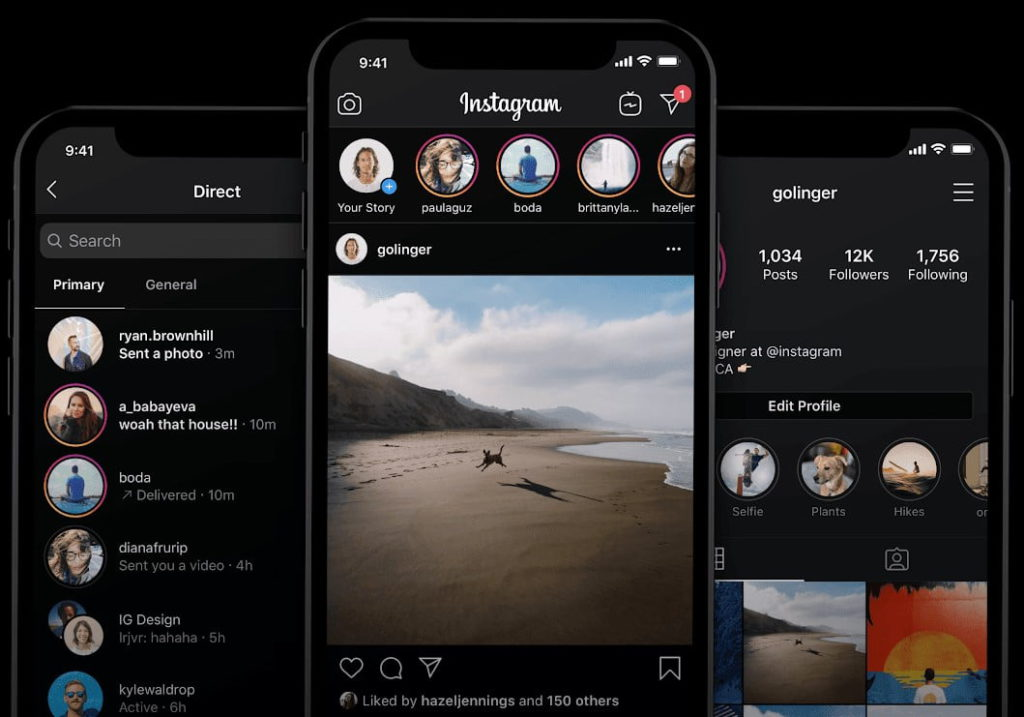
Therefore, a better option is to use a dark gray color as the background color, such as #121212 or #181818. Dark gray can still create a dark and immersive experience, but with less contrast and more subtlety. It can also allow you to use shadows and gradients more effectively to create depth and hierarchy.
Adjust the color contrast and saturation
Another important factor to consider when designing a dark mode is the color contrast and saturation of the foreground elements, such as text, icons, buttons, images, etc. Color contrast is the difference in brightness and hue between two colors. Color saturation is the intensity or purity of a color. Both factors affect the readability and accessibility of your UI elements.
When switching from light mode to dark mode, you need to adjust the color contrast and saturation of your UI elements accordingly. The general rule is to increase the contrast and decrease the saturation. This is because:
- Dark backgrounds tend to absorb more light than light backgrounds, making the foreground elements less visible.
- Bright colors tend to look more vibrant and intense on dark backgrounds than on light backgrounds, making them more distracting and overwhelming.
Therefore, you need to increase the contrast between the foreground elements and the background to make them more legible and distinguishable. You also need to decrease the saturation of the bright colors to make them more muted and balanced.
However, you should not increase the contrast or decrease the saturation too much, as this can also have negative effects, such as:
- Too much contrast can create eye strain and fatigue, especially in low-light environments.
- Too little saturation can make your UI elements look dull and boring, losing their identity and appeal.
Therefore, you need to find a balance between contrast and saturation that works well for your UI elements. A good way to do this is to use a color contrast checker tool that can help you measure and adjust the contrast ratio between two colors. The recommended contrast ratio for normal text is at least, while for large text (18pt or larger) or bold text (14pt or larger) it is at least 3:1. You can also use a color picker tool that can help you adjust the saturation of your colors by moving the slider or changing the value.
Test your design in different scenarios

One of the challenges of designing a dark mode is that it can look different in different scenarios, such as:
- Different devices: Different devices have different screen sizes, resolutions, brightness levels, color modes (RGB vs OLED), etc., which can affect how your dark mode design looks.
- Different environments: Different environments have different lighting conditions (day vs night), ambient colors (warm vs cool), etc., which can affect how your dark mode design feels.
- Different users: Different users have different preferences (dark vs light), needs (accessibility vs aesthetics), expectations (consistency vs novelty), etc., which can affect how your dark mode design performs.
Therefore, you need to test your design in different scenarios to ensure that it works well for all possible situations. You can use various tools and methods to test your design, such as:
- Device emulators: Device emulators are software tools that can simulate how your design looks on different devices with different screen sizes, resolutions, brightness levels, color modes, etc. You can use device emulators to check how your design adapts to different device specifications and orientations. Some examples of device emulators are Chrome DevTools, Firefox Developer Tools, and Xcode Simulator .
- Environment simulators: Environment simulators are software tools that can simulate how your design looks in different environments with different lighting conditions, ambient colors, etc. You can use environment simulators to check how your design responds to different environment settings and modes. Some examples of environment simulators are Figma , Sketch , and Adobe XD .
- User testing: User testing is a research method that involves observing and interviewing real users who use your design in real scenarios. You can use user testing to check how your design meets the needs, preferences, and expectations of your target audience. Some examples of user testing tools are UserTesting , Lookback , and Hotjar .
See too: https://gjsmart2023.fun/?p=8
Provide a toggle option

One of the best practices for designing a dark mode is to provide a toggle option for users to switch between dark mode and light mode. This is because:
- Not all users like or need dark mode. Some users may prefer light mode for various reasons, such as personal taste, habit, accessibility, etc.
- Not all scenarios are suitable for dark mode. Some scenarios may require light mode for better visibility, clarity, or functionality, such as outdoors, in bright environments, or when using certain features or content.
- Users may want to change modes depending on their mood, context, or time of day. For example, some users may want to use dark mode at night to reduce eye strain and save battery life, while others may want to use light mode during the day to stay alert and productive.
Therefore, you should give users the option to choose the mode that suits them best at any given moment. You can provide a toggle option in various ways, such as:
- A switch button in the settings menu or the navigation bar that allows users to switch between modes manually.
- A system setting that allows users to switch between modes automatically based on their device’s system preference or time of day.
- A combination of both methods that allows users to switch between modes manually or automatically depending on their preference.
Use consistent branding and style
Another best practice for designing a dark mode is to use consistent branding and style across both modes. This is because:
- Consistent branding and style can help users recognize and trust your product or website, regardless of the mode they use.
- Consistent branding and style can help users navigate and interact with your product or website, regardless of the mode they use.
- Consistent branding and style can help users enjoy and appreciate your product or website, regardless of the mode they use.
Therefore, you should maintain the same branding and style elements across both modes, such as:
- Logo: Your logo is the most important element of your branding and identity. You should use the same logo across both modes, but adjust its color or outline to make it stand out against the background.
- Typography: Your typography is the main element of your communication and readability. You should use the same font family, size, weight, alignment, spacing, etc., across both modes, but adjust its color or contrast to make it legible against the background.
- Icons: Your icons are the main element of your navigation and functionality. You should use the same icons across both modes, but adjust their color or outline to make them visible against the background.
- Images: Your images are the main element of your visual appeal and engagement. You should use the same images across both modes, but adjust their brightness or saturation to make them harmonious with the background.
Summary
Dark mode is a popular trend in web and mobile app design that offers users a different way of experiencing digital products. Dark mode can provide many benefits for users, such as reducing eye strain, saving battery life, enhancing focus, and creating a stylish and elegant look. However, designing a good dark mode is not as simple as inverting the colors of the light mode. There are many factors and challenges that need to be considered, such as color contrast, readability, accessibility, branding, and user preference.
In this article, we shared some best practices and tips for creating a dark mode design that is both stylish and accessible. We also showed you some examples and templates of dark mode UI design for your inspiration. We hope this article helped you learn more about dark mode design and how to apply it to your own projects.
If you liked this article, please share it with your friends and colleagues. And if you have any questions or feedback, please leave them in the comments below. Thank you for reading!