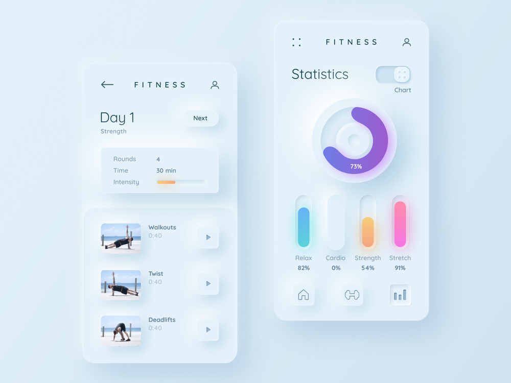
Neumorphism is a term that has been buzzing around the web design community for a while now. It is a design style that combines elements of flat design and skeuomorphism, creating a soft and realistic look for user interface elements. But what exactly is neumorphism, where did it come from, and how can you use it in your own projects? In this article, we will explore the origins, characteristics, advantages, and challenges of neumorphism, as well as some examples and tips to help you create stunning neumorphic designs.
What is neumorphism?
Neumorphism is a portmanteau of the words “new” and “skeuomorphism”. Skeuomorphism is a design style that mimics the appearance of real-world objects, such as buttons, switches, knobs, etc. It was popular in the early days of digital design, especially in Apple’s products, as it helped users to interact with unfamiliar interfaces by using familiar cues. However, skeuomorphism also had some drawbacks, such as being cluttered, inconsistent, and outdated.
Flat design emerged as a reaction to skeuomorphism, aiming to simplify and streamline the user interface by removing unnecessary details and using geometric shapes, solid colors, and minimal typography. Flat design was embraced by many designers and companies, such as Google’s Material Design and Microsoft’s Fluent Design. However, flat design also had some limitations, such as being too abstract, boring, and hard to distinguish.
Neumorphism is a design style that tries to find a balance between flat design and skeuomorphism. It uses subtle gradients, shadows, and highlights to create a soft and light look for UI elements, making them appear to be extruded from or inset into the background. Neumorphism also preserves the simplicity and clarity of flat design, using minimal colors and shapes. Neumorphism creates a sense of depth and realism for the user interface, without sacrificing functionality and usability.
Where did neumorphism come from?

Neumorphism is not a completely new concept. It has some roots in the early days of computer graphics, when 3D effects were used to create realistic-looking icons and buttons. However, neumorphism as we know it today was popularized by a UX Collective post from December 2019, which coined the term and showcased some examples of neumorphic designs. Since then, neumorphism has gained a lot of attention and traction in the design community, with many designers creating and sharing their own neumorphic works on platforms like Dribbble and Behance. Neumorphism has also been adopted by some apps and websites, such as Spotify and Apple Music.
What are the benefits of neumorphism?
Neumorphism has some advantages over other design styles, such as:
- It creates a pleasant and soothing aesthetic for the user interface, using soft colors and shadows.
- It adds a sense of depth and dimension to the user interface, making it more engaging and immersive.
- It enhances the affordance of UI elements, making them more intuitive and interactive.
- It allows for more creativity and experimentation in UI design, offering new possibilities and variations.
See too: https://gjsmart2023.fun/?p=13
What are the challenges of neumorphism?
Neumorphism also has some challenges that need to be addressed by designers, such as:
- It can be hard to achieve contrast and accessibility in neumorphic designs, especially for users with visual impairments or color blindness.
- It can be difficult to maintain consistency and harmony in neumorphic designs, especially when using different colors or shapes.
- It can be tricky to implement neumorphic designs in code, especially when using complex shadows or gradients.
- It can be risky to follow neumorphism as a trend without considering its impact on user experience or business goals.
How to create neumorphic designs?
Neumorphic designs can be created using various tools and techniques. Some of the most common ones are:
- Using CSS properties such as box-shadow, border-radius, background, filter, etc. to create neumorphic effects for UI elements.
- Using online generators such as Neumorphism.io or CSS-Tricks to create neumorphic styles for UI elements.
- Using graphic design software such as Adobe Photoshop, Adobe Illustrator, Sketch, Figma, etc. to create neumorphic mockups for UI elements.

Conclusion
In this article, we have learned what neumorphism is, where it came from, and how it can be used in UI design. We have also explored the pros and cons of neumorphism, as well as some examples and tips to help you create your own neumorphic designs. Neumorphism is a design style that combines elements of flat design and skeuomorphism, creating a soft and realistic look for UI elements. Neumorphism is a trend that has gained a lot of popularity and attention in the design community, but it also has some challenges and limitations that need to be considered. Neumorphism is not a one-size-fits-all solution, but rather a tool that can be used to enhance the user interface, depending on the context and the purpose. We hope that this article has given you some insights and inspiration to create your own neumorphic designs. And don’t forget to leave your honest opinion and suggestions in the comments. See you next time!
